Sunday, August 17, 2025

The Artisanal Touch: How Gunko Street Infuses Soul into Luxury Logos for Enduring Brand Legacy

In the discerning world of fashion and luxury, where every detail whispers a brand's story, the choice of typography isn't merely aesthetic—it's foundational. It's the silent narrator of your heritage, the visual echo of your craftsmanship. Generic fonts blend into the noise, but a truly distinctive typeface like Gunko Street carves out a unique identity, imbued with handcrafted authenticity.

Imagine the deliberate stroke of an artist's brush, the subtle impression of a skilled artisan's hand on a raw material. That's the essence of the Gunko Street font. It’s not just a collection of letters; it’s a living testament to imperfection refined into artistry. Each character possesses a spirited individuality, an organic flow that feels personally penned, yet utterly sophisticated. Its lines aren't rigidly geometric; they dance with a subtle, human rhythm, marrying classic elegance with a fresh, contemporary pulse. Gunko Street has a personality that is both grounded and aspirational, whispering tales of genuine creation.

Consider "Lumen & Thread," a burgeoning luxury apparel brand known for its ethically sourced, small-batch collections. Their exquisite garments spoke volumes, but their initial, clean sans-serif logo felt cold, failing to convey the warmth and soul woven into every fabric. It lacked the immediate, visceral connection to the artisan's touch that their clientele cherished. They faced the challenge of translating their brand's meticulous, handcrafted ethos into a visual identity that felt authentic and unforgettable.

This is where the Gunko Street font stepped in, not as a solution, but as an awakening. When Lumen & Thread reimagined their logo with Gunko Street, the transformation was profound. The slightly irregular baseline and the organic, almost calligraphic flourish of its strokes instantly conveyed a sense of bespoke craftsmanship. The logo no longer felt mass-produced; it resonated with the painstaking care poured into each garment, speaking directly to the brand’s dedication to quality and human connection. It turned a sterile mark into a warm, inviting signature, instantly elevating their presence in the luxury market.

Gunko Street stands apart for its unparalleled ability to imbue your brand with an unmistakable spirit of genuine creation. Here's why it's an indispensable tool for fashion and luxury houses:

  • Unrivaled Authenticity: Each character feels individually drawn, making your brand’s message resonate with a deep, personal touch that mass-produced fonts simply cannot replicate.
  • Emotional Resonance: It fosters a deeper, more intimate connection with your audience, telling a powerful story of passion, heritage, and meticulous dedication.
  • Distinctive Brand Voice: In a crowded marketplace, Gunko Street ensures your luxury brand leaves an indelible, memorable mark, asserting its unique identity with elegant confidence.
  • Versatile Elegance: While inherently handcrafted, its design maintains a sophisticated balance, suitable for a myriad of high-end applications without compromising readability or prestige.

Gunko Street: The Signature of Soulful Luxury.

This isn't merely typography; it's a strategic asset for creating a tangible narrative of quality and exclusivity.

Practical Applications:* Iconic Logo Design: Forge a signature brand mark that feels bespoke, irreplaceable, and deeply connected to your luxury products.* Exclusive Packaging: Transform your product packaging into an experience of tactile luxury, whispering tales of artisanal quality before the item is even revealed.* High-Fashion Editorial: Elevate magazine layouts, lookbooks, and campaigns with a distinctive, artistic voice that commands attention and conveys prestige.* Digital Storytelling: Seamlessly translate the tactile, handcrafted feel of your brand into your website, social media presence, and digital campaigns, ensuring a consistent and compelling experience across all touchpoints.

Discover how Gunko Street can transform your brand's narrative and forge an enduring connection with your discerning audience. Learn more.


The Artisanal Touch: How Gunko Street Infuses Soul into Luxury Logos for Enduring Brand Legacy

Strawberry Frosty: The Soulful Minimalist for Iconic App Logos

In the bustling digital landscape, where every pixel fights for attention, mobile app designers face a constant quest: to craft experiences that are both visually stunning and profoundly intuitive. You seek clarity, elegance, and an authentic voice for your brand, often with minimal screen real estate. This is where Strawberry Frosty arrives – a font designed not just to be seen, but to be felt.

Imagine a fresh breeze sweeping through your design files, clearing away the clutter, leaving behind only essential beauty. That's the essence of Strawberry Frosty font. It's a journey into modern minimalism, distilled into elegant lines and perfectly balanced negative space. Each character breathes with a quiet confidence, offering a clean, airy presence that feels naturally sophisticated. It’s a font that doesn't shout; it speaks with serene precision, evoking a sense of calm and effortless quality that resonates deeply with contemporary aesthetics.

For mobile app designers like you, Strawberry Frosty isn't just another typeface; it's a strategic partner in shaping memorable user journeys. In a world saturated with visual noise, this font cuts through with unpretentious grace, allowing your app’s core message to shine. Its inherent readability ensures a frictionless user experience, making navigation, information display, and interaction feel seamless and inviting, whether on a smartwatch or a tablet.

The true power of Strawberry Frosty lies in its versatile simplicity. It’s the ideal choice for creating a cohesive and distinctive brand identity, from the initial splash screen to every in-app notification. Think about your app's logo: with Strawberry Frosty, you can sculpt a wordmark that is instantly recognizable, clean, and memorable, like a perfectly balanced emblem – consider a finance app’s clean initial, or a wellness app’s serene full name. It transitions effortlessly from crisp UI labels and button text to impactful headlines on onboarding screens, always maintaining its subtle elegance. This isn't just a font; it's the quiet backbone of a premium mobile experience, enhancing brand recall and building user trust through its understated perfection.

Strawberry Frosty: Pure Clarity, Effortless Impact.

Ready to infuse your mobile app with a touch of authentic, modern minimalism? Dive deeper into the serene strength of Strawberry Frosty font and discover how its natural elegance can transform your designs. Learn more about how this unique typeface can help your app stand out, authentically and beautifully.


Strawberry Frosty: The Soulful Minimalist for Iconic App Logos

Sunday, August 10, 2025

How to Craft Compelling Luxury UX: Using Jonattan Antonio to Perfect Website Headlines Like 'Discover Bespoke Elegance' or 'The Art of Refined Living'

In the meticulous world of UX/UI design, every element shapes user perception, from the subtle click of a button to the commanding presence of a headline. For designs where luxury and sophistication aren't just aspirations but absolute requirements, generic typography simply won't suffice. Enter Jonattan Antonio, a font meticulously sculpted to embody the essence of high-end design, transforming interfaces into expressions of unparalleled prestige.

Jonattan Antonio is more than just a typeface; it’s a digital artisan. Its personality is a harmonious blend of classic elegance and contemporary flair, reminiscent of bespoke craftsmanship. Each curve, every stroke, and the delicate balance of its letterforms exude a quiet confidence and an inherent sense of value. Think of it as the digital equivalent of haute couture—uncompromisingly refined, effortlessly captivating, and undeniably exclusive. This Jonattan Antonio font whispers exclusivity and commands attention, making it the quintessential choice for projects demanding an air of gravitas and timeless appeal.

Imagine this scenario: You’re a lead UX/UI designer tasked with revitalizing the digital presence for an exclusive private banking firm. Their current website, while functional, feels uninspired, failing to communicate the unparalleled trust and bespoke service they offer. The generic sans-serif fonts in use dilute their brand identity, making them blend into a sea of competitors. You introduce Jonattan Antonio for key elements. Suddenly, headlines like "Curated Wealth Management" resonate with authority, and calls to action such as "Schedule Your Private Consultation" gain an irresistible allure. The entire user journey transforms from a transactional interaction to an immersive experience of bespoke luxury, solving the critical challenge of brand perception and user engagement.

Jonattan Antonio stands out because it delivers more than just visual appeal; it builds trust and reinforces brand equity. Its key benefits for UX/UI designers are clear:

  • Unrivaled Brand Identity: Instantly establishes a premium, sophisticated voice for any digital product or service. Jonattan Antonio font becomes synonymous with quality.
  • Enhanced User Experience: While luxurious, Jonattan Antonio is designed for clarity and legibility, ensuring an effortless reading experience even in critical UI elements. It guides the eye with graceful precision.
  • Emotional Connection: Evokes a sense of exclusivity, trust, and aspirational quality, forging a stronger bond with discerning users.
  • Versatility in Sophistication: From commanding headlines to elegant button labels and compelling calls-to-action, Jonattan Antonio adapts seamlessly, maintaining its dignified presence across diverse UI elements.

This sophisticated typeface is ideally suited for luxury e-commerce platforms, exclusive hospitality and travel sites, high-end real estate portals, elite financial services applications, and digital art galleries. Picture Jonattan Antonio gracing the main titles of a luxury watch boutique, guiding users through a high-fidelity car configurator, or adding gravitas to the member's area of a prestigious club application.

Jonattan Antonio: Where Digital Sophistication Begins.

Ready to infuse your designs with unparalleled luxury and refined elegance? Discover the transformative power of Jonattan Antonio. Download Jonattan Antonio now and redefine what's possible in premium digital experiences.


How to Craft Compelling Luxury UX: Using Jonattan Antonio to Perfect Website Headlines Like 'Discover Bespoke Elegance' or 'The Art of Refined Living'

Cloth Font: Your Bookstore's Brand, Handcrafted with Heart (Logos & Letters that Feel Like Home)

Hey there, indie bookstore aficionado! You know, the one who spends hours curating shelves, recommending forgotten gems, and probably smells faintly of old paper and new ideas? Yeah, you.

I'm Cloth, and while I don't have pages, I do have a story. And I think it's a story you'll want to stitch right into the fabric of your brand. You're not just selling books; you're selling an experience, a haven. And in a world screaming for authenticity, you need a visual voice that whispers 'real.' That's where I, Cloth, come in. I’m not some stiff, corporate typeface cooked up by algorithms. Oh no. Each curve, every line of the Cloth font, feels like it was drawn by a human hand, with a bit of ink on the finger and a smudge of creative spirit.

Think of me as your digital artisan, ready to lend that irreplaceable, handcrafted touch to your modern marketing. I fit right in, whether you're designing a new bookmark, an online event poster, or the cover of your latest staff pick. My special sauce? It's that raw, genuine charm. I solve the challenge of sounding 'mass-produced' when you're anything but. I say, 'We care about the details, the craft, the heart behind every single thing we do here.' I'm readable, yes, but the Cloth font also tells a story before anyone reads a single word. I make your brand approachable, warm, and utterly unique, just like that quirky first edition you just acquired.

So, if you're looking to wrap your brand in warmth and character, remember: Cloth: Stitching Your Story, Authentically.

Imagine me as the friendly face on your new loyalty program cards, making customers feel like cherished members of a special club. Picture me gracing your custom-made journals, turning them into instant keepsakes. Think about your storefront sign – with the Cloth font, it won't just say 'Books,' it'll say 'Welcome Home.' From your Instagram posts announcing a new author reading to the bespoke thank-you notes tucked into online orders, I bring that human touch. And for your logo design? Oh, the Cloth font shines! I can give your independent bookstore's emblem that perfectly imperfect, 'made-with-love' feel. No cold, sterile lines here – just a warm, inviting embrace that says 'come in, explore, stay awhile.'

Ready to see how I, the Cloth font, can help your independent bookstore weave a truly authentic visual tale? Don't just take my word for it. Go on, give me a test drive. I promise, I play well with others (especially good stories). Learn more about Cloth and see me in action.


Cloth Font: Your Bookstore's Brand, Handcrafted with Heart (Logos & Letters that Feel Like Home)

Saturday, August 9, 2025

Cultivate Connection & Clarity: How Aesthetic Styles, the Friendly and Approachable Font, Naturally Enhances User Experience, Strengthens Digital Brand Identity, and Creates Memorable Logo Designs for Web Developers.

In the bustling digital landscape, where every pixel competes for attention, what truly sets a website apart? It's not just slick animations or cutting-edge frameworks; it's the authentic connection forged with your audience. As web designers and developers, we know the power of a genuine human touch in a virtual space. And that’s precisely where Aesthetic Styles steps in.

Aesthetic Styles isn't merely a collection of characters; it’s a warm handshake in digital form. Imagine a friend’s reassuring smile, translated into typography – that's the essence of this font. Its unique personality shines through gentle, inviting curves, perfectly balanced proportions, and a subtle, handmade warmth that feels organic and approachable. It's designed to make your users feel instantly at ease, fostering a sense of trust and familiarity from the very first glance. This font doesn't shout; it engages with a welcoming whisper.

Consider a scenario many of us face: you’ve landed a new client, a local artisanal bakery launching their online store. Their brand ethos is all about community, freshly baked goods, and a cozy, inviting atmosphere. You've tried various popular sans-serifs, but they either feel too stiff and corporate or overly playful, missing that crucial balance of warmth and professionalism. Then, you introduce Aesthetic Styles. Suddenly, the headlines on the homepage sing with sincerity, making the "Order Now" button feel less like a command and more like an friendly invitation. Product descriptions feel like personal recommendations from the baker herself, and the "Our Story" page breathes authenticity, truly drawing users into the narrative. Aesthetic Styles bridges that critical gap, making the digital brand feel as genuine and accessible as the charming brick-and-mortar shop.

What makes Aesthetic Styles stand out as an indispensable tool in your toolkit?* Unrivaled Emotional Connection: It goes beyond simple readability, cultivating trust and rapport. Every character is designed to resonate, transforming cold text into a warm, inviting conversation.* Exceptional Versatility: From impactful hero headers that grab attention with an inviting whisper, to subtle UI elements that guide users effortlessly through complex interfaces, Aesthetic Styles adapts. It’s perfect for crafting engaging blog titles, clear navigation menus, compelling testimonials, and even the subtle text on interactive buttons, ensuring consistency and approachability across all touchpoints.* Effortless Readability: Despite its distinct personality, Aesthetic Styles is meticulously crafted for optimal legibility across all devices and screen sizes. Its balanced letterforms and thoughtful spacing ensure a comfortable reading experience, reducing eye strain and enhancing user engagement.* Brand Identity Reinforcement: This font empowers you to build digital brands that feel genuinely human, approachable, and utterly memorable. For instance, it's an exceptional choice for logo design, allowing for the creation of marks that are clean, friendly, and deeply resonant with their target audience – imagine a startup's new logo, simple yet radiating warmth and trustworthiness, all thanks to the approachable lines of Aesthetic Styles.

Aesthetic Styles: Where Every Pixel Connects.

Ready to infuse your next web project with genuine warmth, impeccable clarity, and a deeper connection? Explore the full potential of Aesthetic Styles and see how it can transform your designs into truly engaging experiences.


Cultivate Connection & Clarity: How Aesthetic Styles, the Friendly and Approachable Font, Naturally Enhances User Experience, Strengthens Digital Brand Identity, and Creates Memorable Logo Designs for Web Developers.

Beautiful Pirates: Swashbuckle Your Blog's Style with Timeless Panache in Every Layout

Ahoy, gorgeous! Ever felt like your amazing content deserves a font that whispers tales of timeless charm, yet refuses to be boring? Meet Beautiful Pirates, the font that’s about to become your new secret weapon for captivating your audience and anchoring your unique brand identity.

Forget everything you thought you knew about pirates. Beautiful Pirates font isn't about rough seas and tattered sails; it's about the sophisticated script found on an ancient, exquisitely crafted treasure map, whispering secrets of beauty and discovery. It’s fluid, graceful, and carries the weight of enduring history, yet feels perfectly at home in your most modern, curated flat lay. Imagine elegance with a mischievous glint in its eye – that’s Beautiful Pirates.

As a lifestyle blogger, you’re not just sharing stories; you’re curating dreams, inspiring adventures, and building a world your audience longs to step into. But how do you ensure your digital space feels as authentically 'you' and as exquisitely curated as your favorite vintage find? Generic fonts just won't cut it when you're aiming for a brand that feels truly, deeply memorable. This is where Beautiful Pirates sails in. It’s the design equivalent of that perfect antique locket – a piece that tells a story, adds character, and instantly elevates everything around it, setting your brand apart with an undeniable air of timeless elegance.

This isn't just a pretty typeface; it’s a strategic style choice. It helps you forge a brand identity that's sophisticated without being stuffy, and adventurous without being chaotic. It ensures your headlines aren't just read, but felt, evoking a sense of heritage and bespoke artistry. The timeless elegance of Beautiful Pirates font will make your audience pause, linger, and return, solidifying your unique place in their digital landscape.

Ready to make your content truly unforgettable? Imagine these possibilities:

  • Dreamy Blog Post Titles: Craft headlines that beg to be clicked, like "A Parisian Weekend: My Guide to Timeless Cafés" or "Unearthing Vintage Treasures in My Own Backyard," using the font to give them an immediate sense of allure and importance.
  • Elegant Editorial Layouts: Use it for captivating pull-quotes or the subtle, luxurious subheadings within your travelogues, home decor features, or fashion editorials, guiding your readers with a touch of old-world charm.
  • Pinterest Perfection: Elevate your Pinterest pins with quotes that resonate, giving them an heirloom quality that stands out in a sea of sameness.
  • Charming Digital Products: Design irresistible e-book covers, workshop materials, or lead magnets that feel like a cherished gift, promising curated content inside.
  • Social Media Flair: Add an unexpected touch of class to your Instagram story templates or feed graphics, turning mundane updates into miniature works of art that are distinctly you.

Beautiful Pirates: Unearth Your Blog's Timeless Story.


Beautiful Pirates: Swashbuckle Your Blog's Style with Timeless Panache in Every Layout

Thursday, August 7, 2025

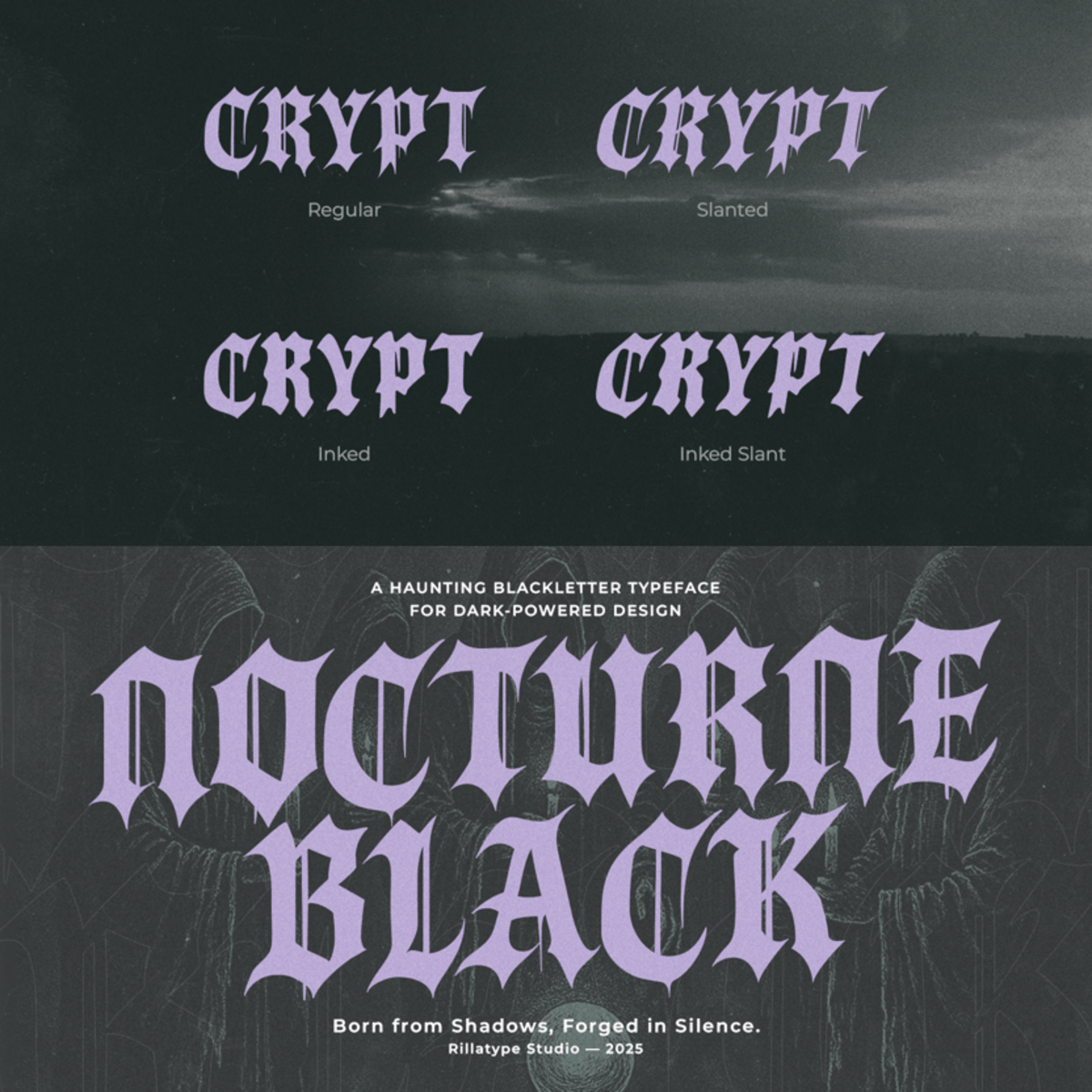
Is RT Nocturne Black the tech-forward typeface your independent bookstore needs for captivating website headlines like "Curated Collections" or "Virtual Author Events"?

In the evolving landscape of independent bookstores, where physical charm meets digital reach, your brand's visual identity must speak volumes. It's about more than just selling books; it's about crafting an experience, nurturing a community, and staying relevant in a world driven by innovation. This is where RT Nocturne Black emerges as a transformative element for your visual narrative.

Imagine a typeface that embodies the precision of modern technology while retaining an inherent grace that resonates with the quiet power of literature. RT Nocturne Black is exactly that. It's a font born from tech-inspired innovation, featuring clean, architectural lines and a confident structure that exudes sophisticated clarity. Each character is meticulously crafted, giving it a distinct, almost luminous quality on screen and in print, evoking a sense of forward-thinking curation. It doesn't shout for attention; it commands it with understated confidence, suggesting a bookstore that is both deeply rooted in tradition and boldly stepping into the future.

For the independent bookstore owner, RT Nocturne Black isn't just an aesthetic choice; it's a strategic asset. In an increasingly digital world, your online presence is often the first impression. This font provides a clear, compelling voice that translates your unique curatorial vision into a tangible digital experience. It ensures that whether a customer is browsing your latest arrivals on a tablet or signing up for an online author talk via their phone, the text they encounter is effortlessly readable, impactful, and reflective of your brand's discerning quality. It empowers your brand to communicate with a distinct, contemporary edge, setting you apart in a crowded marketplace.

RT Nocturne Black lends a singular authority to your messaging. It elevates website navigation, makes event schedules effortlessly sophisticated, and gives email newsletters a polished, inviting feel. Envision headlines like "Beyond the Bestseller: Discover Hidden Gems" or "An Evening with [Author Name]" rendered with a clarity and presence that truly captivates. Use it for sleek social media graphics announcing "New Release Spotlight" or for digital in-store signage. RT Nocturne Black bridges the gap between the timeless appeal of books and the dynamic pulse of modern communication, forging a coherent and memorable identity for your independent bookstore.

RT Nocturne Black: Precision in Every Page.


Is RT Nocturne Black the tech-forward typeface your independent bookstore needs for captivating website headlines like

The Brand Designer's Guide: Infusing Editorial Layouts with Timeless Elegance Using Meltipop Stacked

Imagine a typeface that doesn't merely convey words, but whispers stories of enduring quality and sophisticated legacy. Meltipop Stacked...